
But I kept putting it off, hoping I’d wake up one morning looking like Keira Knightley. Finally, I got real and started making appointments.
First up was a trip to my hair stylist friend, who streaked, cut and blow dried my hair. When she was done, she examined her work and said, “I think I’d call your color ‘nutmeg’.”
“Nutmeg,” I repeated. “Perfect for my pictures. Call me Nutmeg Cabot.”
She, and others around her, stared at me blankly. (Okay, lesson learned: hold the YA jokes for the YA audience.)
Next I went to my Mary Kay friend who did amazing things with foundation and smoky blue eye shadow. Then I grabbed the clothes my daughter had decreed somewhat cool and author-like. And finally I met my photographer friend in a park, where she posed me by trees and rocks, and was very patient with my incessant blinking and the fact I don’t know my left from my right.
With such a power team behind me, I suddenly believed I could do this (!) and started having fun. And lo and behold, when the photos came back, there were actually two I liked!
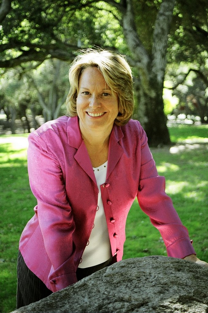
So here they are. Would you guys tell me which you’d think makes a good Author Tina impression? And maybe why? For simplicity, you can vote “pink” (for the fuschia/raspberry jacket) or “green” (for the teal/aquarmarine overshirt).

Much appreciated!
Tina
Top Ten Uses for An Unworn Prom Dress, Feb. 2007
How to Hook a Hottie, Spring 2008


23 comments:
Pink! Definitely pink!
Love both pics Tina. You look amazng and I love the "Nutmeg Cabot" remark. Hilarious!
Just put us in the spice cabinet! Since *I* am salt&pepper to go with your nutmeg. hahahahaha!
Both pics are both adorable! Must be the subject matter. HA! Seriously, you must know you have a GREAT smile. But I vote for Pink Tina. Not only does it color-coordinate with the cover of "Prom Dress" but I LOVE that dappled sunlight.
I vote for PINK! Although you look cute in both pictures, in the pink one you look more relaxed and natural. And I love that pink jacket.
~Simone
LOL!! Love it, Tina!!
I'm going to be the contrarian. I love the pose in the teal...like you know a secret no one else knows. I think they're both great pics, but my vote is for teal.
Marley = )
http://www.marleygibson.com
Like everyone, I think both are great. But if we're forced to pick ... teal.
In the teal you look the most relaxed, the most natural. In the pink there's a little hint of "executive photo" for me -- maybe it's the blazer collar, maybe it's the strong shoulder. I feel like I get a better image of "you" in the teal ... and like I might not recognize you in person from the pink.
Just my opinion. =)
Thanks for weighing in, everyone! I kept nodding my head while reading, even though some of the opinions differed. For instance, Tera Lynn said the pink one looks like an executive photo--I think so, too, which makes me lean toward the green. But I also think the pink is more flattering of me. So I go 'round and 'round... But I am relieved and thrilled to be in this position!
Tina
I say go with the teal. I think that the teal pose is more "you."
Be sure to let us know which one you choose.
Janie
Tina, you know my first vote was for the green. The pose is so cute and perfect for your book, but on the other hand, I love the sunlight with the pink. It's awesome! So I went with the pink but thrilled with both of them. =D
Tina~
Sorry I'm signing in so late on this. You are so gorgeous & funny! Nutmeg Cabot, where do you come up with this stuff?
If I counted right it's four pinks and three teals, but it's late so that's probably wrong.
I love both but I would definitely go with PINK! Hope that helps!
xo,
Steph
Chiming in late...
I like the pink. But you know you're adorable in both! And I love nutmeg, it's one of my favorite spices and authors. Hee.
you look like your being frisked in the pink picture. go with the teal. you look nice in both.
Pink. In the blue you look like a teacher. Not a bad thing... but maybe not for the back of a YA book:)
Teri
Hey Kelly, Steph, Heather and TJ--I SO appreciate the votes and thoughts.
And "Anonymous", your frisking comment made me LOL. And I see your point!
Overall, it's pretty much a tie...so maybe I'll put them both on my website media page and let reviewers choose?
Thanks, everyone!
Tina
What a great problem to have, Tina...two FAB pictures! = )
They're both great, Tina! But, I prefer the pink...looks more fun!
Shannon
Thanks for weighing in, Shannon! And when is that book of yours coming out??? Soon, I hope!
Tina
I like the teal picture better! I agree with the other anynymous, it looks like you're being frisked. You look pretty in both though!
Thank you, Anon #2! And I should tell you both that I needed to submit a head shot this week to accompany an interview and I used the pink one--cropped to my head only. That frisking pose is our little secret...
Tina
Teal. looks more.... i'm not sure. I like it better.
Ciao Tina!
You can't go wrong with either one, but something about the sunlight in the pink pic makes me choose that one. Either way, you look bellissima! :)
Natalie
P.S. I loved the "Nutmeg Cabot" reference...ha! :)
I vote Pink. The blue one is a little too professional... ur going for fun here, right? The pink looks more causal. It could be one of those things where you are just standing around and you end up in a great pose and a friend snaps a photo. The blue looks too planned.
~Sarah
Ciao, Natalie & Sarah, two of my favorite "Fruili" friends! :)
I'm thrilled by all the voting, and it presently looks like Pink 9, Green 7. Still what I consider super close!
Tina
Tina I'm a big big fan of the green one you look super relaxed and just amazing! I also love the pink one but the green one to me just pops I love it!
Post a Comment